Tidbit Tuesday | Cartograms by Transportation Mode
September 17, 2013
Every Tuesday, the Mayor’s Office of Transportation & Utilities (MOTU) posts a map or graphic that tells a story about transportation or utilities in the City of Brotherly Love.
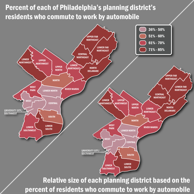
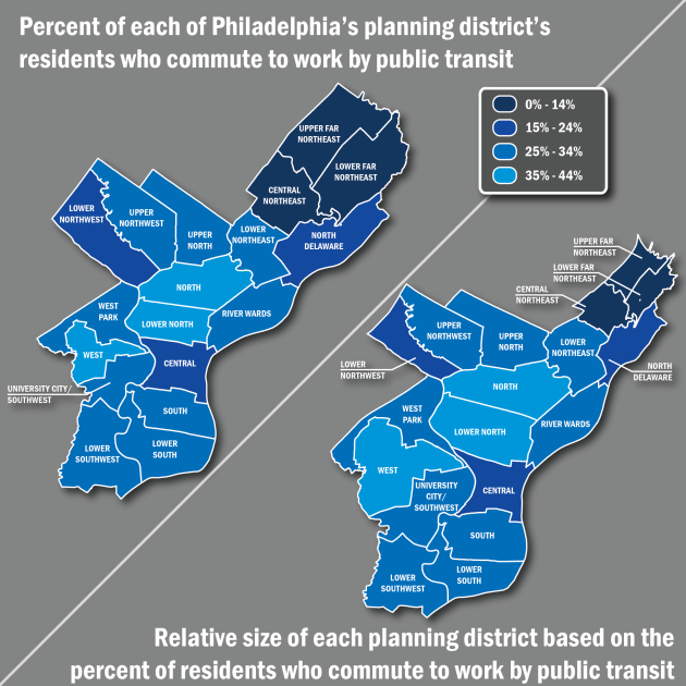
This week is a MEGA Tidbit Tuesday — we have THREE GRAPHICS to share with you! Over the last year, we have looked at how Philadelphians commute to work a number of times. This week we are again examining this data but instead of just coloring Philadelphia’s planning districts based on the percentage of residents that use various modes, we have distorted the maps and altered the size of the planning district relative to the percentage of residents that commute to work by a particular mode. We have made each graphic with the undistorted map on left and the distorted map on the right.
The first mode we looked at was the automobile:
While the automobile does not show a ton of distortion, a small amount is evident.
We then looked at the percentage of each planning district that commutes to work by public transit:
Here we see a moderate amount of distortion as we see higher relative concentrations of commuters who take public transit in the North, Lower North, and West districts.
Finally, we looked at bicycle commuting:
![Cartogram_Bike [Converted]-01](https://phillymotu.files.wordpress.com/2013/09/cartogram_bike-converted-011.png?w=630) This map shows that relative to the other districts, there are high concentrations of commuters who get to work by bicycle in the University City/Southwest, Central, and South Districts.
This map shows that relative to the other districts, there are high concentrations of commuters who get to work by bicycle in the University City/Southwest, Central, and South Districts.
This type of distorted map is called a cartogram. It is a useful tool to map relative values (such as percentage of commuters who take a certain mode within a district) in a visually interesting way. All of the data used for the above maps is derived from the 2007-2011 American Community Survey which can be accessed through US Census’ American FactFinder.


You must be logged in to post a comment.